Categories
Tutorial

A New Form of Academic Communication

Across college campuses, various academic departments utilize newsletters to share information on upcoming events, faculty publications, and student spotlights. On the administrative side, these tend to take a long time to make. On the reader’s end, they can be informative but not exciting.

In addition, while constant communication with your reader is of great importance, in academia newsletters tend to be published at the end of each semester or school year— when we are most overwhelmed by our work and more prone to ignoring our emails. Also, while effective graphic design is fundamental to attracting the reader’s attention, it does not come naturally and easy to most people in and outside academia. As I sought solutions to these common problems, I came across email newsletters.

Categories
Best Practices

The Power of Pausing Social Media

This week, Instagramers noticed a new tool on the digital platform. Instagram now offers its users the opportunity to press pause on all notifications for a set amount of time. With this update, any user can stop receiving push notifications for 15 minutes, 1 hour, 2 hours, 4 hours, or 8 hours. This way, constant updates on posts, stories, messages, etc. do not appear on your screen, unless you decide to open the Instagram app directly on your phone. Therefore, when you have an important task at hand or when you simply want to enjoy time away from the screen, you can now choose to reduce the amount of interaction that you have with the platform.

This, indeed, brings an important topic to mind: our social addiction to screen time. Last year, Social Media Today published an article addressing the question of How Much Time Do People Spend on Social Media? Unsurprisingly for some, on average “teens now spend up to nine hours a day on social platforms” while “the average person will spend nearly two hours on social media everyday, which translates to a total of 5 years and 4 months spent over a lifetime.” Overstimulation, sleep disruption, online harassment, and poor concentration are only some of the effects associated with heavy use of Social Media. Everytime we choose to enter the world of Social Media we are exposed to these factors- the longer we stay on, the greater the risk.  

As a doctoral student, I know plenty of peers who choose to deactivate their accounts to focus on their work. Others, feel the need to turn off their phones altogether when heavily immersed in their research. Thus, it is promising to see social media platforms recognize the need to disconnect, if only momentarily. It is true that, while many phones have allowed users to block notifications from a particular application, not many allow one to simply pause these, and recommence them at a later time. Also, certain applications allow the user to mute notifications, yet these are usually messaging apps, such as WhatsApp and Messenger. This option is especially useful at times when the conversation does not involve the user or when the user is not interested in what is being said. Yet, for a social media platform like Instagram, whose main goal is to grasp the public’s attention through an endless amount of photos and videos, the motive for offering a pause option seems to speak to different needs.

By allowing users to pause their interaction with the platforms, these may not only promote a healthy life for their users but even put their own interests aside. Instead of focusing on providing a data gold mine for companies, they seem to be making a greater effort at providing functional and convenient services to its users when needed. We can, as a result, access Social Media at a set time and, perhaps, take advantage of the helpful features offered by the platform, instead of wastefully navigating for hours its sometimes turbulent, never-ending, and mind-numbing content.

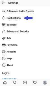
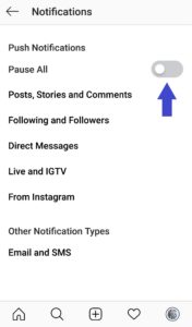
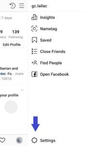
Follow these steps to pause Instagram:

1. Press the ≡ (menu) button

2. Press the ⚙️ (settings) button

3. Press the 🔔 (notifications) button

4. Press the “pause all” button

5. Choose a time

Categories
Tutorial

A New Form of Audiovisual Storytelling

What is Story Maps?

Story Maps is a web application that combines multimedia content (photos, videos, audio) with narrative text, allowing the author to tell a variety of stories while providing the audience with an engaging experience. In a way, it is reminiscent of your typical PowerPoint presentation, yet it is far more visually appealing and it provides a better flow of content. Instead of slides, one controls two independent dimensions which interact with one another: the horizontal axis, which organizes data in rough order of priority, and the vertical axis, which presents insight into the data. Overall, as an academic, you can create easy-to-share presentations for the classroom or for conferences. Also, through Story Maps, you can create a resume, a work portfolio, a blog… the options go as far was your imagination allows.

What does a Story Map look like?

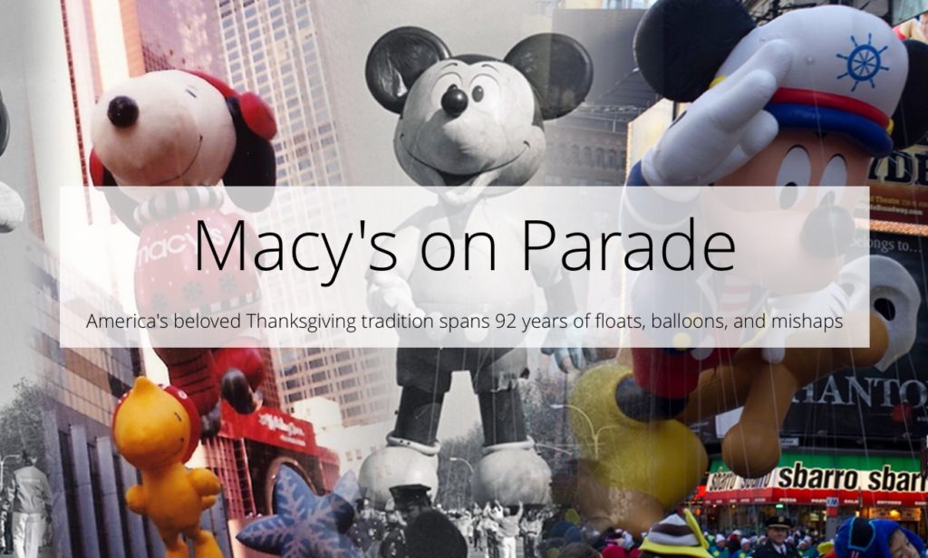
Good question. The best way to explain this is by showing you some examples. The best user-friendly platform for Story Maps is ESRI. There you can find various samples, such as these:

Click the image above
Click the image above

Why Story Maps?

Make your work stand-out! It can be difficult to make academic subject matter be attractive and captivating, engaging and intriguing, pleasant and easy to understand. With Story Maps you can provide your audience with a cohesive continuous stream of information that appeals to the senses. Furthermore, hosted by an internet platform, you are provided with a website address, making Story Maps easy to share and to access in the digital age. What is more, Story Maps work on a variety of screen sizes- from PCs to mobile phones- making them virtually accessible to anyone anywhere.

How to create Story Maps?

As mentioned above, the recommended platform for creating Story Maps is ESRI. It is free, self-explanatory, and provides tons of help and advice for creating your Story Maps. Your presentation will be edited, stored, and hosted by ESRI. There, you can choose from a series of templates that can help you start your Story Map:
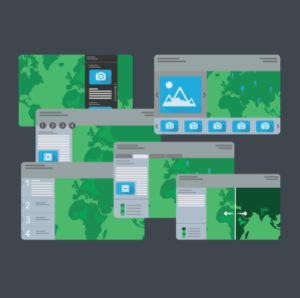
As you begin to create your Story Map, the interface will direct you to its many options for browsing/adding/editing/placing text/images/videos/audio:
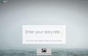
Would you like a detailed tutorial on creating Story Maps? Let us know in the comments below.

Is there a catch?

Indeed, while the end product (when done correctly) looks simple and effortless, it takes patience and creativity to create a successful and effective Story Map. Additionally, it goes without saying that you need visually-appealing content to produce the presentation. After all, you can resort to open-source content when needed.


I would like to thank the GCDI Digital Fellows, Olivia Ildefonso and Javier Otero Peña, for their “Introduction to ESRI Story Maps” workshop. It was there where I learned about Story Maps.

Categories
Critical Scholarly Communication

Ethically Bound Research in Social Media

With the rapid growth of social media outlets, its users have willfully shared personal information, most often unaware that in doing so they have allowed what they considered private to become public. Researchers interested in tapping into this information may ethically consider informed consent as a critical component of their scholarly work.

Categories
Critical Scholarly Communication

Making Social Media More Social

My experience as a Social Media Fellow has been one of growth and discovery. I had the opportunity to learn from Jennifer Prince, my predecessor, about the multifaceted world of social media. To my surprise, I became aware of the many steps taken to provide the public with an informative and visually-pleasing experience. Once I met the team of Social Media Fellows I felt immediately welcomed. Needless to say, they all have a level of expertise and a willingness to help that I greatly appreciate. On our very first meeting, as we discussed our goals for the year, one of us mentioned the importance of making our role be understood and portrayed as “human”. Unaware of precisely what was meant, we asked for an explanation, which resonated with me once it was provided. Indeed, it seems that for those of us who manage an institution’s social media outlets there tends to be, ironically, little connection between ourselves and our audience. Meaning that while we successfully reach a general public, our audience does not get to see that every action taken on social media is made by a particular individual. Individuals who, like my predecessor, developed sites, attracted a following, and continuously developed content that would allow for growth and enthusiasm in site followers. It was at this moment when I realized that my presence, my efforts, and actions as a social media fellow, could be unacknowledged without direct contact with our audience. I, most importantly, could lose sense of my audience, unaware of their inevitably changing interests and expectations. Thus, I decided to speak directly to my audience. In our case, our public is composed of students and faculty members who belong to our corresponding academic departments. I engaged in a series of conversations with some of them to learn if there was something missing, something that had been unaccounted for, something that would make the audience’s experience more enjoyable and informative. A common suggestion arose: more communication for the purpose of sharing common interests. For example, there were many accomplishments made by the students and faculty that went unacknowledged on the academic department’s social media sites. At the same time, it became clear that the content provided by the department’s sites also slipped through the cracks of the ever-expanding feeds of our users. It was important to communicate directly with the students and faculty without, nevertheless, coming across as obnoxious and repetitive. With this in mind, I began to use pre-established sources of communication, such as group conversations in which most members of the department were already connected to. There, I was able to communicate more informally and directly, reaching my target audience immediately and amiably. A sense of community began to develop that allowed for content of interest and relevance to be exchanged in a social and friendly manner. Thus, while my presence became more apparent, our sites became more social. Our sites became more representative and thus more interesting. A true interest grew, not only within the academic department but the social media community as a whole. We began to gain followers and receive responses from unexpected yet significant sources. Our social media sites improved by becoming indeed more “human”, more social, more connected. We brought the “social” back into social media by engaging directly, in-person, with each other. In my experience, human contact showed to be the ultimate asset to develop social media sites. Behind our screens, whether those of our laptops or of our cell phones, we attempt to develop a social network. Yet, without developing a dialogue with our public, we can easily lose sight of who composes it and what they are expecting to see when visiting our sites. In return, my efforts were vocally appreciated. I felt less robotic and more connected to a community eager to share their interests, passions, and accomplishments.