Across college campuses, various academic departments utilize newsletters to share information on upcoming events, faculty publications, and student spotlights. On the administrative side, these tend to take a long time to make. On the reader’s end, they can be informative but not exciting.
In addition, while constant communication with your reader is of great importance, in academia newsletters tend to be published at the end of each semester or school year— when we are most overwhelmed by our work and more prone to ignoring our emails. Also, while effective graphic design is fundamental to attracting the reader’s attention, it does not come naturally and easy to most people in and outside academia. As I sought solutions to these common problems, I came across email newsletters.
Email newsletters tend to be shorter than traditional newsletters, which allow content to be created easily and be read quickly. Also, these are usually sent out more frequently, which increases reader engagement. Thus, instead of preparing one document which gathers the accomplishments of one semester or one school year, several departmental updates are sent out throughout the semester in small visual batches. Also, as the name suggests, email newsletters are presented in the body of an email. This way, they are presented directly to the reader while being easily accessible.
Since I have begun to use email newsletters, these have increased awareness of departmental decisions, plans and changes. Also, the use of email newsletters has encouraged members of the department to share information about their own accomplishments— excited for these to be featured in upcoming email newsletters. Lastly, by being in constant communication with students, alumni, faculty and staff, the use of email newsletters has increased a sense of belonging among members of the department.
DESIGNING YOUR EMAIL NEWSLETTER
While email newsletters may be seen as time-consuming and tiresome, the process of creating them can be eased by efficient and reusable design. The following are tips which can help in creating email newsletters:..
LAYOUT AND ORGANIZATION
One column: Single-column layouts are readable across different screen sizes.
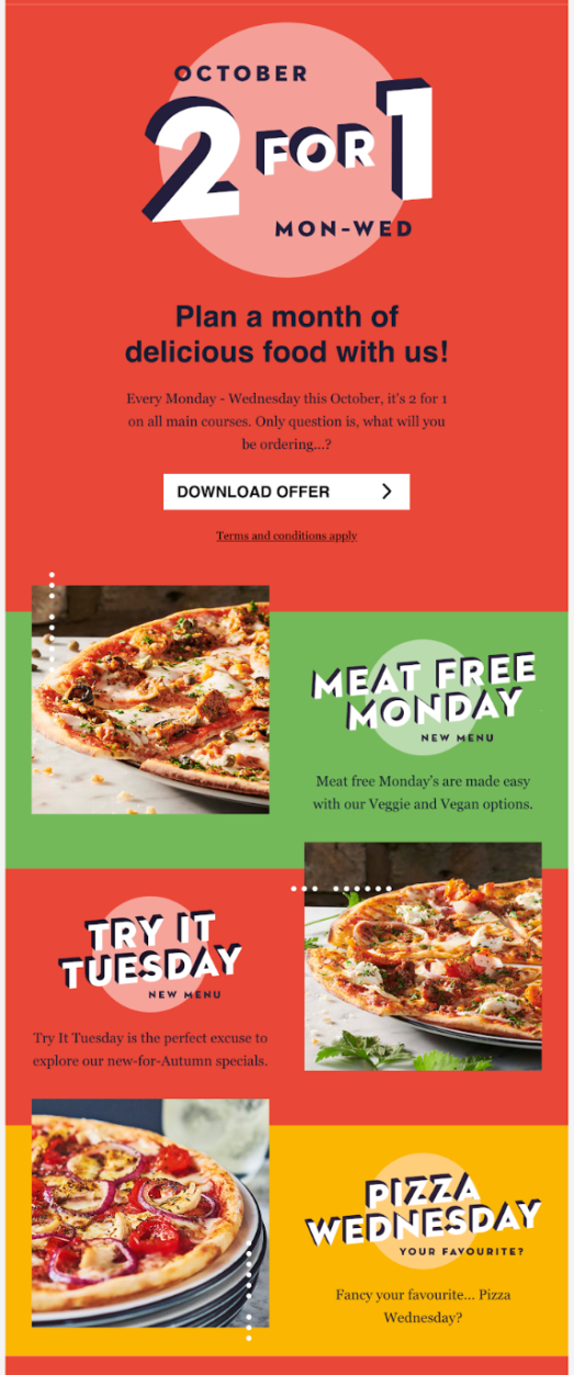
Hierarchize content: A clear hierarchy eases the reader’s experience.

Use white space: Blank areas help focus attention on content areas.

LINKING OUT AND INTERLINKING
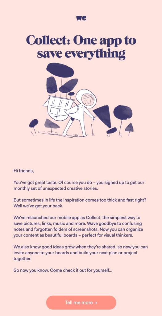
Use links: Linked content makes the reader’s experience more dynamic.
CUNY Academic Commons
Your email newsletter can redirect readers to content on your Commons website. They can also redirected to your department’s social media outlets.

Short sentences
Not everyone is interested in everything. Keep your email newsletter compact and easy-to-read, while inviting readers to engage with additional content.

STREAMLINE
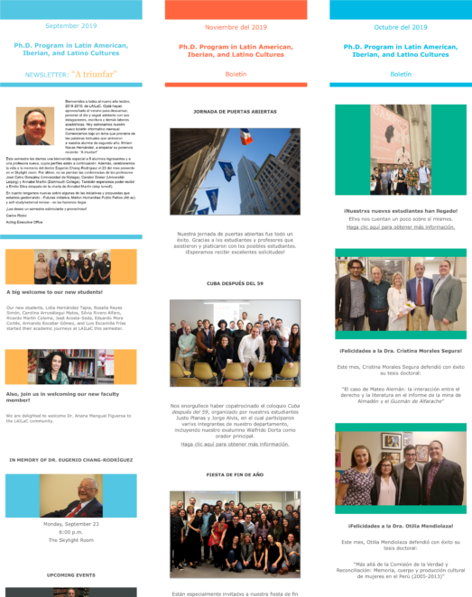
Consistent layouts and designs are easy to create, replicate, and follow.
STAY UP-TO-DATE
Consider changing your layout and design from time to time (perhaps from semester to semester). For design inspirations, make sure to check current graphic design trends..
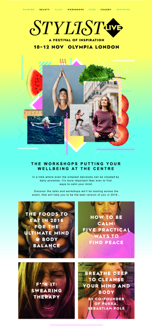
Bold text: At the moment, big and bold headings are in.

Bold colors: At the moment, vibrant and bright colors are in.
There are various online services that can be used to create and use email newsletters such as MailChimp, MailJet, Litmus, and Benchmark. While some offer free accounts, others have paid plans. If you want to avoid the hassle, there are tools offered by The Graduate Center, CUNY which can be used to create email newsletters.
For example, the GC community currently has access to Microsoft Office, which includes Publisher. This graphic design application, while simple and basic, it is easy to use— especially if you are well-acquainted with other Microsoft Office applications. It even includes built-in templates for common academic needs: such as event flyers, conference programs, academic calendars and business cards.
SHARING YOUR EMAIL NEWSLETTER
AS THE BODY OF AN EMAIL
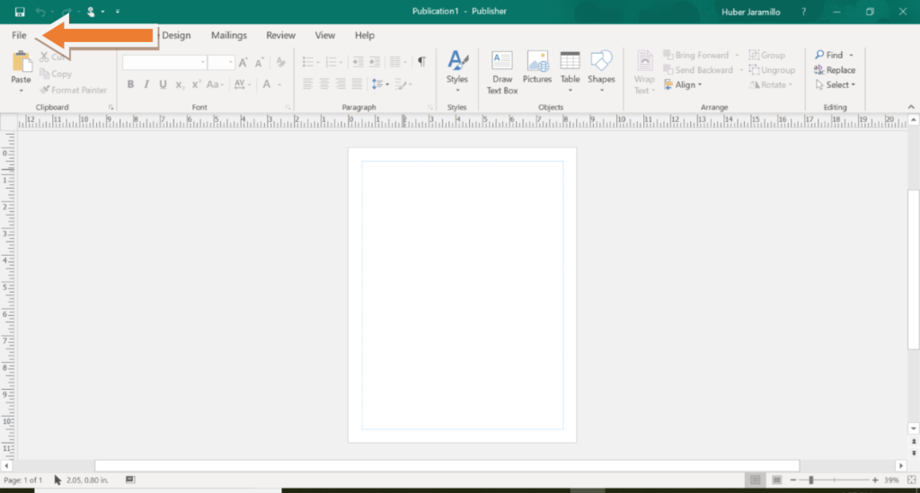
Publisher offers the option to use one’s design as the body of one’s email. As a Microsoft Office product, it interacts well with Microsoft Outlook (used by CUNY faculty) and Outlook.com (used by CUNY students), making it easy to share across these email platforms. Once you have created your email newsletter, in order to share and use your design as the body of your email, follow these steps:
- Click File.
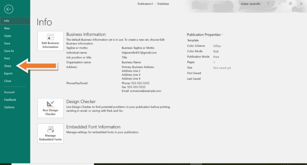
- Click Share.
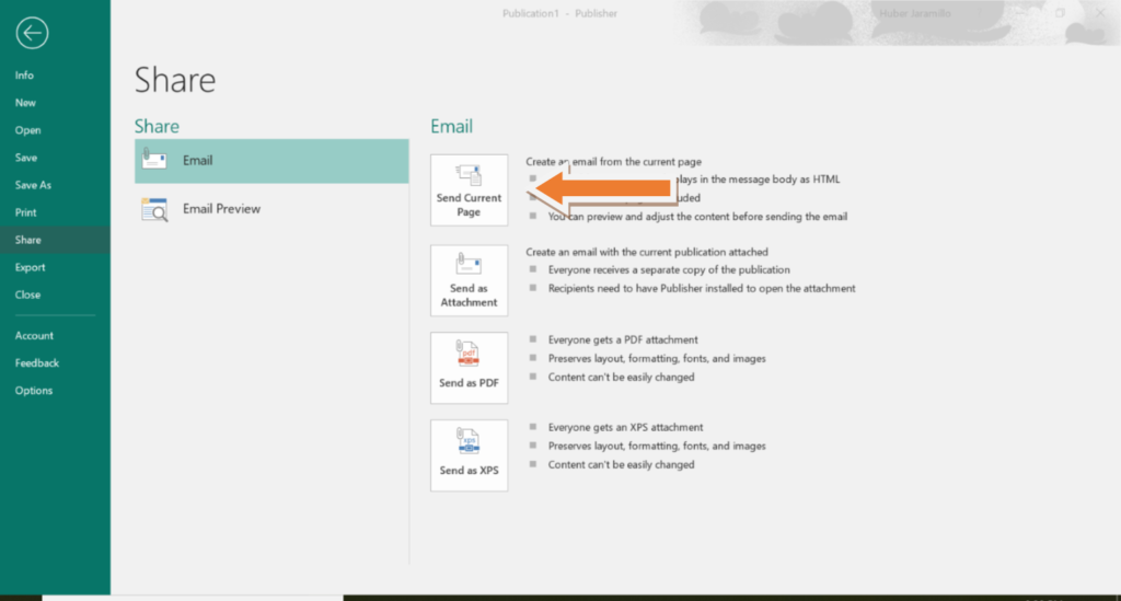
- Click Send Current Page.
- Select Recipients and include your Subject line.
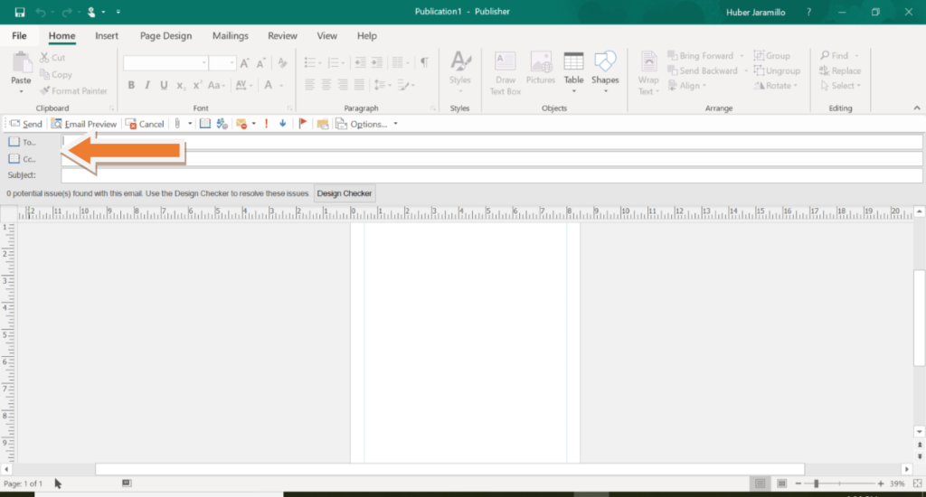
- Use Design Checker to ensure that your design will export without problems.

- To make sure that your design has exported without problems, you may want to export and send the design to your own email before sending it to your recipients. This way, you can confirm that the presentation of the newsletter is as desired.
AS A PDF FILE
You can also share your email newsletter as a PDF file and attach it to an email:
- Click File.

- Click Share.

- Click Send as PDF.

- Outlook will open, with the PDF file attached to an email.
AS A COMMONS POST
You can also share your email newsletter throughout your social media outlets by posting your PDF file on your CUNY Academic Commons page and sharing a link to it with your followers.

